
I started with a full audit of the e-commerce experience, mapping customer journeys across the major purchase paths and using user data to identify where people got stuck or dropped off. The audit surfaced something unexpected: most friction points weren't major issues or errors, and they weren't at checkout. They were small but compounding inconsistencies in how certain information was conveyed across the experience that could lead users to distrust the app overall.
Solution
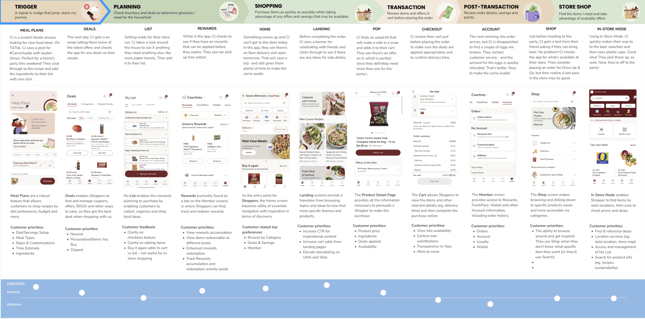
To identify and fix those issues, I created a customer journey map to visualize what customers needed to know at each stage, which questions went unanswered, and where copy errors caused confusion. This became the shared reference point to make content decisions feel grounded in customer behavior rather than team preference.
I developed content guidelines and made them available in the formats teams used most often (e.g., Figma, Confluence). I clarified user flows, structured content for scannability, and rewrote copy and CTAs. For example, I replaced generic “Add” buttons with clearer “Add to Cart.” Why it mattered: Action clarity builds confidence and speeds decisions, reducing drop-offs in high-intent moments. I updated copy and CTAs for accessibility.
I then worked with product and design teams to prioritize and assign work within their sprints, and I established regular check-ins to ensure progress.
Outcome
We completed nearly all recommended changes within three months. In our second semiannual audit, we found 80% fewer errors across the experience. More meaningfully, by reducing friction and streamlining flows, the content work contributed to 21% growth in online sales that year — a result that made the case for treating content quality as a product investment, not a cleanup task.
Semiannual audits became a standing practice from that point forward, ensuring the improvements held and the guidelines continued to be applied consistently as new teams and features were added.